
I have good memories on reading M.Pirsig’s novel ‘Zen and the Art of Motorcycle Maintenance‘. It was the Dutch version, so I now know some nuances were lost in translation. Also, it was over 45 years ago, and with that, it is long overdue for a new read.
Covers:
If I may believe the more than a handful of accomplished bestselling writers’ groups on Facebook, I have to invest in hiring a professional to design the cover of my books. In traditional publishing, with a publisher’s house, they will take care of this as it is included in their fees. But when self-publishing as I am, the consensus seems to be to hire an accomplished artist with experience in book cover design, and let this person create an attractive cover for your book.
AI:
Many self-publishers seem to choose AI assistance to create attractive covers for their books. There are websites and apps that help you with that, either for free or against a fee.
By itself, an AI is unable to create any artistic content without having been trained to do so. The way to train an AI today, is by having it consume large volumes of existing art collections and train it to deploy its ‘knowledge’ on demand. In my view, this ‘knowledge’ consists of a mixture of copyrighted and free material available online and downloaded into the AI’s training materials. The problem of distinguishing between free and copyrighted materials makes the AI unsuitable for the creation of any artistic creation – you’ll never know what copyrighted art the AI is using for any given assignment.
DIY:
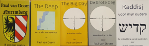
All covers for my books are created by me. I use either public domain picture material that I edit, or I create my own picture material. My covers are simple and follow a style that I developed for my books. This style is simple:
- Book title
- Picture
- Sub-title
- Author name
Examples:
Facebook:
As mentioned above, the groups on Facebook are clear that investments have to be made. You have to hire an editor to proofread and correct your manuscript, and you have to hire an artist to create your cover. In many cases, writers ask the group to comment on the cover design they created or had created for them. The groups are often relentless in how you must do: no AI, no DIY, hire a pro!
In rare moments of bravery, I have sometimes commented on these questions and even provided examples of my own cover designs. Usually, the pro’s are clear: my cover designs are too simple, unattractive, and do not disclose what the book is about. This last thing seems rather hard to predict without reading the book in question though. The verdicts ‘simple’ and ‘unattractive’ are personal opinions, but one that I do not value very much.
I’ve read thousands of books over the years, and many of them were either unattractive in my view, and/or did not disclose anything related to the book’s content at all – after having read the book! Nevertheless, I did enjoy alsmost all of these books, inspite of the covers.
In 50-ies and 60-ies Dutch literature, and no doubt even in other languages, there was a cultural revolution going on within writing. Modern language elements were invented and explored, new words and construction developped, formatting challenged, and the cover designs more than reflected these new freedoms.
A front to back completely hard yellow cover containing pink letters in a rather simple font were suddenly possible. None of these elements revealed anything about the content, oter than perhaps you might expect modern and perhaps slightly experimental content. In retrospect, I have to admit I disliked most of these covers but did apprreciate the content very much.
My book covers:
The cover of my book ‘Nuremberg‘ is yellow-brownish with the large weapon of the city in the middle of the cover. The title and sub-title are printed in a classical old-fashioned german font, while my name is in a regular font that I found matches the german font quite well. With the benefit of hindsight, I conclude that I would use different colors and perhaps fonts today.
For the subsequent books, I had manage to develop some sort of standard for my covers, using yellow for the english titles, grey for the dutch. The pictures are now mostly in black and white, sometimes in pastell colors. I aim for a consistent font, allthough the size may slightly differ between books – depending on the chosen picture.
A reader:
As a thanks, I recently sent my latest book ‘Ukraine‘ to a couple YouTube content creators supporting the Ukraine resistance. One of them was quick to react that he absolutely loved the cover:
 ..which I appreciated very much, thanks Wes! At least I’m not the only one satisfied with the cover any more!
In other words:
Taste is relative and not a measure to hold the book against.
How do I buy books:
The general facebook writer’s group consensus is that a DIY book cover design will not sell your book.
When browsing books, I do the following:
- Check the title and sub-title
They should reveal something about the book’s content and make me curious - Read the blurb on the back of the book
Should change my mind from ‘interested’ to ‘wanna read!’
Note that the cover design is not a part of my selection process at all. However, as I assume many people look at the cover design first, I aim to present an attractive design that appeals to my readers. If it does: fine. If it doesn’t: so be it. Can’t argue the relativity of taste.
Oh, and the cover for the Zen book mentioned earlier: I did not find it great, but the title certainly was!
Paul
2025-11
Sweden